Remain for license
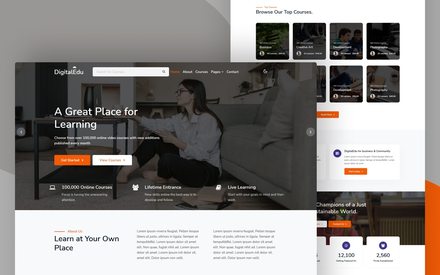
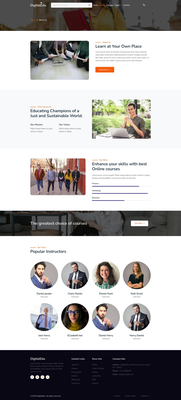
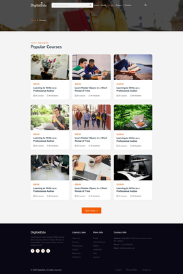
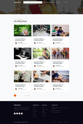
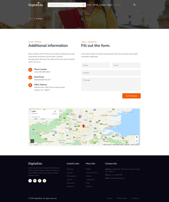
Description Digital Edu – Education course website template Digital Edu template is a clean and modern HTML5, Bootstrap education course website template with predefined web blocks and sections which helps you to build your own site. This template design is suitable for Educational Institutions like universities, colleges, academies, education centers, online course / Online learning courses and events & much more. Clean, crisp, and simple design that can easily be adapted and used for variety of similar niche websites. It has a massive collection of useful features, and it is capable of adapting to almost any education purpose institutes. With this revolutionary HTML5 website template, even a child can build a website for free. This comprehensive education website template includes a beautiful home page demo, and other pages with clean and modern layouts that make it easy for users to navigate through your educational content. This template has a fully responsive layout. It fits perfectly on various displays and resolutions from regular desktop screens to tablets, iPads, iPhones and small mobile devices. Digital Edu – The ideal way to spread knowledge. Everything needed to create a First-class online education website. Home page Showcasing your Home Page to your potential or regular clients in style is essential. This page comes with a custom text logo, a search form, pre-installed menu and a dark mode switch, a beautiful banner slider, browse top categories section, attractive hoverable grids, counting numbers, a video popup, newsletter subscription form, testimonials slider, and a comprehensive dark footer. Let’s have a look at some of their features of this website template. Banner Owl Carousel slider: The banner slider has arrows to change the slides manually and each slide has call to action buttons that takes you to the about page and courses pages with a click on it. If you want to link to some other pages, you can change it according to your needs. The sliding becomes dynamic due to smooth spring animations. With a punchy text you can entice the visitor to jump to any specific page on the website. Does any new discount offer to launch? This is the place to do it. Header Search form: Your website can have a host of online courses and searching them can be another task for the users. This search form in the header helps users or visitors to find a course of their choice. Browse our Top Courses: For online education/course providers, this section can be of great value. This section or block has a list of course category image cards. There are clickable category cards to navigate into every niche of courses you have hosted on your website. Active statistics: Numbers are the best ways to impress first-time visitors. A horizontal active stat on the home page has number counters showing the number of successfully trained people, proudly received awards, firmly established branches or course institutes. The statistics section is supported by a block of content with insightful information and two call-to-action buttons. What People say: This is the customer testimonial section on the home page. Blending with the trademark of the template, that is, the review or customer feedback follows the same. The layout is innovative with content in a separate box and info below showing the customer details. About Page: Everyone coming to your website will be eager to know the quality of your education services. And the best way you can convince him or she is by showing enough content on your website. This beautifully designed page comes with about section, why choose us, skills section and instructor’s section. Skills/Progress Bars: A “skill bar” is often used in any of your websites to display your skills and achievements in different subjects. These skills bars or progress bars have horizontal bar indicators for presenting your skills, experiences and knowledge. Teachers/Instructors: It is the great way to represent teachers. Create an eye-catching informative presentation of your teachers and instructors in the easy way. A team section with the social media icons and the hover effect makes the team component attractive with a remarkable look. This page is interactive, organized, and easy for users to follow, which makes it a great inspiration, that works for your business and your target audience. Having good organization will keep leads on your page longer and cause them to spend more time checking out your education courses and services. Captivating and Practical Courses page It’s all here – layouts for showcasing individual courses with titles and cost per course, lessons and count of students enrolled for a particular course. Popular Courses: If you build a website for school or college or any educational institute, you can list the courses you offer along with the details in these cards. By clicking on the image or title of the course, you can link them to pages containing more details. You can also list eLearning courses here linking to the course page. Each course card has an image, cost, title, number of lessons, and number of students. The card styling is clean and neat, and the way of arranging images in the card with hover effects make the website page to look more attractive. Blog Page on website The Blog page on website can be used to share updated information about your institution or from the world. Even students can contribute their writings on topics of their choice. Sometimes, blog posts can have an overwhelming amount of information — for the reader and the writer. The trick is to organize the info in a way so readers aren’t intimidated by length or amount of content. This blog gives the most up-to-date information to the World about your education courses. This template includes a Blog page and a blog single page with which you can avoid expensive web development and minimize your design cost by using these neat and clean blog pages. These postcards in the blog page are beautifully arranged with light-colored page background, a box-shadow and a card hover effect make them look like animation adding dynamism that can give your readers an immersive browsing experience. Contact Page for website Most contact pages are designed with function in mind. They slap an email address, phone, and location on a plain background and call it a day. But basic contact pages don’t inspire visitors to reach out and connect. Other pages make it easy to contact the company – which is awesome. So, what makes the perfect Contact Us page? An awesome Contact Us page finds just the right balance between making it easy to reach the company and sharing resources users can use to answer their questions right away. A usually plain contact page for website can always be elevated by great conversational copywriting. At first glance, our contact page looks pretty bare. There’s no graphics, no quirky copy, just a plain light background input field contact form. This contact page includes all the standard information — name, subject, email, map location, contact details like office address, mail id, phone number and so forth. There’s a lot going well for this contact page: the beautiful design, the calls-to-action, the clearly displayed contact information, the contact form for visitors who want to get in touch with specific inquiries, and a location map for visitors or users who want to reach to the address of your company. Main Features: Html5, CSS3 and Bootstrap Responsive Website Template Clean & Unique Design Easy to customize Full-width banner slider Magnific Video popup plugin Newsletter subscription form Testimonial’s owl carousel slider Dark mode enabling feature Counting number statistics Landing page included Working contact form Much more Pages Available in website template: Pages Starter Liberty Home ✓ ✓ About ✓ ✓ Courses ✓ ✓ Contact ✓ ✓ Blog ✓ Blog Single ✓ Landing Page ✓ 404 ✓ Please keep the backlink to w3layouts.com, if you are downloading the template for free. If you are using the website template for commercial purposes consider buying a Liberty License. Design by w3layouts.com Template Information: Template Name : DigitalEdu an Education Category Bootstrap Responsive Web Template. License: Starter License and Liberty License . Compatible Browsers: Google Chrome, Firefox, Safari, IE 10, Opera, etc. Source Files included: HTML files (.html), Style Sheets (.css), Images (.jpg/png/gif), JQuery plugins (.js), Fonts (.ttf). High Resolution: Yes. Relevant Templates: Studious (HTML) Studious (WordPress) Relevant Posts: How to Be an SEO Content Writer Education School Website Templates Images: Unsplash Pexels
Tags:
| Source Website | https://w3layouts.com/template/digital-edu-a-education-course-website-template/ |
|---|---|
| License | ------------------------- W3Layouts Starter License ------------------------- Thank you for downloading our Website template. By providing a backlink to W3Layouts.com you can use this template for both personal and commercial purposes for free. Else you have to purchase “W3Layouts Liberty License” to use without a backlink. LIMITATIONS - Always keep "Design by w3layouts" in the footer of all pages, backlinking to w3layouts.com - Do not distribute W3Layouts website templates. - Do not offer downloads either the original or a modified version of our website templates. For more details contact support@w3layouts.com |
| Django CMS Version | >= 4.1.2 |
| Last Update | July 15, 2024, 1:42 p.m. |
| Author | None |
| Product Type | Templates |
| Price (excl. tax) | $60.00 |
| Price (incl. tax) | $60.00 |
| Tax | $0.00 |
| Number of reviews | 0 |
